
A Guide To Looker's Custom Map Visualizations

Join us on a path of discovery! In this post we are charting your data from A to B using custom map visualizations that are as unique as your business insights.
Looker ships with default map visualizations out-of-the-box that allow you to explore geographic data. However, these are just the beginning. For those seeking more customized and interactive map visualizations, Looker provides the flexibility to create custom map layers using .topojson or .geojson files.
In this post, we'll take you through the process of creating custom map visualizations in Looker, going beyond the default functionality to unlock the full potential of geographic data analysis.
Default Map Visualizations in Looker
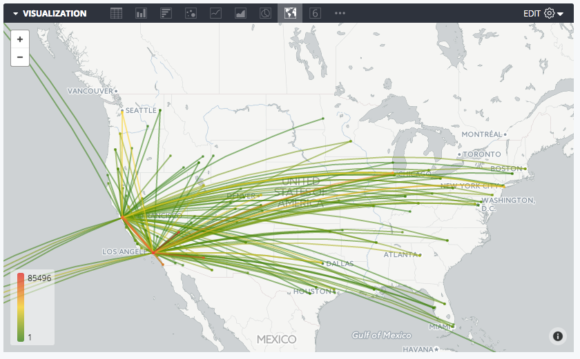
Looker comes equipped with its own map visualization feature, leveraging Google Maps under the hood to offer you an effective way to visualize geographic data. These default map visualizations are ideal for basic geographic analysis, such as heat maps showcasing data distribution across different regions.
The defaults are:
- countries
- uk_postcode_areas
- us_states
- us_counties_fips
- us_zipcode_tabulation_areas
You can use these defaults by using the map_layer_name parameter with your location dimensions.
These are a great place to start, but we know organizations, and therefore business data, have a global reach. Your data viz needs to be flexible enough to reflect this.
Introducing Custom Map Layers
To take map visualizations to the next level, Looker supports the use of custom map layers created using .topojson or .geojson files. These files define specific areas on maps, allowing you to visualize data with greater granularity and customization.
Implementing Custom Map Layers in Looker
The process of implementing custom map layers in Looker involves several steps:
- Data Preparation: Ensure that your dataset includes relevant geographic dimensions, such as country, postcode, or any custom geographic divisions specific to your organization.
- File Acquisition: Obtain or generate the required .topojson or .geojson files containing the geographic boundaries you wish to visualize. We’ve shared some links at the bottom of this page to some repositories that you can use to obtain these files.
- File Integration: Add the .topojson or .geojson files to your Looker project, either by directly uploading them or referencing their URLs.
- Model Configuration: Define custom map layers in Looker's model file, specifying the name of the map layer and associating it with the corresponding .topojson or .geojson file.
- Dimension Mapping: Assign the custom map layer to the appropriate dimension in your dataset, indicating which geographic dimension should be visualized using the custom map layer.
By following these steps, you can seamlessly integrate custom map layers into your Looker projects, empowering you to create tailored map visualizations that align with your specific analytical needs. For further detail, refer to Looker’s documentation here.
See it in Action - Spectacles’ Free Webinar
To illustrate this process in detail, we ran a webinar on this topic, showcasing the creation of custom map visualizations in Looker. From data preparation to dimension mapping, the webinar takes you through how to implement custom map layers and visualize geographic data in Looker with ease, and answers some live questions from our community shared via our Spectacles Slack channel.
Exploring Advanced Options
While custom map layers offer extensive customization options, you may want to take the customization a step further. For instance, you may wish to explore alternative map visualization techniques beyond heat maps. While Looker's native capabilities provide a solid foundation, advanced users can leverage additional JavaScript frameworks like D3.js to develop highly customized map visualizations tailored to their unique requirements. To dive into that further, start by referring to the Looker documentation here.
Looker's support for custom map layers enables you to go beyond default map visualizations and unlock the full potential of geographic data analysis. By following the steps outlined above, you can harness the power of custom map layers to create interactive and visually engaging map visualizations that drive actionable insights.
As always, we’re keen to hear from you! Have you had success using the custom visualizations? Share them with us on Slack or reach out at hello@spectacles.dev.
Spectacles runs webinars every two weeks, designed for the Looker community, that enable you to up-level your Looker instances and leverage the power of Looker across your organization. To sign up to future webinars, visit our website: https://www.spectacles.dev/webinars
.png)


